- Art by Niklas Jansson, 2006-2009-2012. Source:
- https://androidarts.com/mule/mule.htm
- working as of February 2019
M.U.L.E.
Foreword
I stumbled upon M.U.L.E. recenly, as in 2006 or so (It’s when I drew most of the stuff seen here). It’s a game about economics with lots of emergence coming from the interaction between players. It was made in 1983 by Dani Bunten. There are a couple of versions of it, but I prefer the C64 one because of its clean graphics. Anyways, the game has lots of fun aliens and I wanted to draw them.
2012 art
Thoughts which had been fermenting in my mind for a long time began bubbling up so I had to jot something new down. The low resolution of M.U.L.E. leaves a lot of room for imagination, and the various remakes have gone off in various directions. I wanted to see what happened if one tries to stay very faithful to the graphical delivery of the original game. White desert, same iconography, etc. Also, I tried to figure out how things work physically, such as how a Mule deploys into the icon on the land lot.
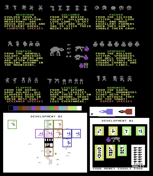
First, some hastily gathered reference:
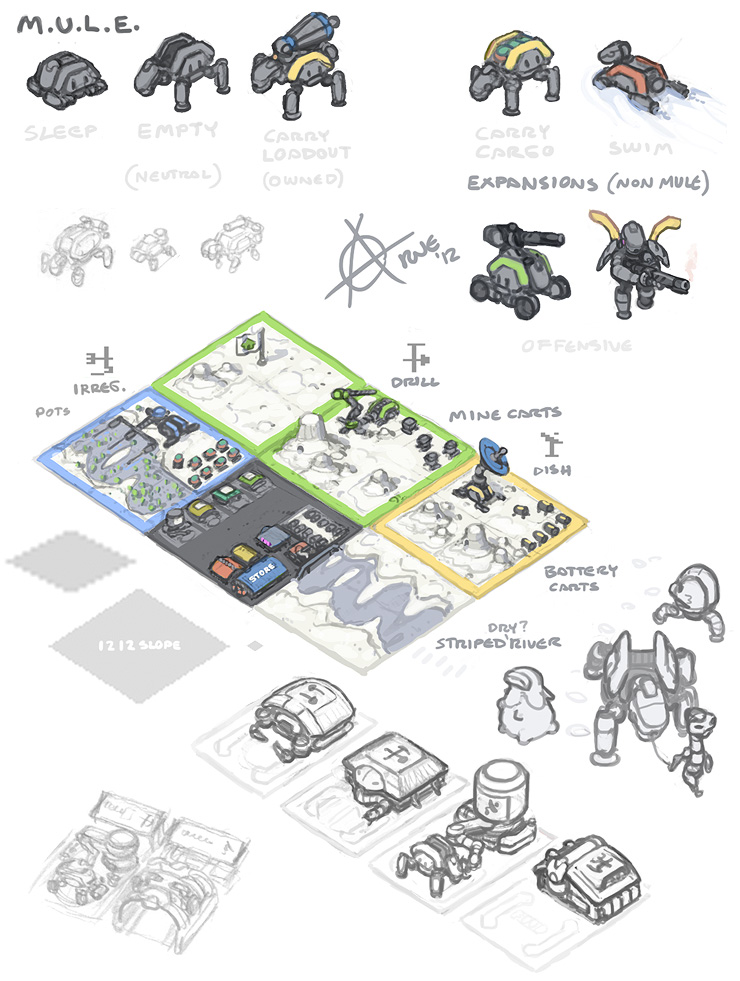
And now the 2012 art. I’ve kept things very rough to work myself towards the many requirements that I set up. Settling on a design too early is like… uh, slowly digging a pit with a polishing brush.
Requirements for the M.U.L.E. design (walker thing).
- Should not be a straight AT-AT clone, but have the same general feel and masses.
- Should be a fun, iconic design which would look cool as a toy.
- Should be able to transform/deploy into every land icon.
- If a mule malfunctions and runs off it takes everything (deployed) with it or wrecks it (IIRC). Guess it could explode too, but it’s more fun to see it run away. Perhaps it gained higher sentience and started a new life elsewhere. After all, that happened to the Mechtrons.
- Should be expandable (the design should be usable in other environments/games).
With the mule design, I think my current, rough design is getting there, but at this stage I can’t say whether the design is fun or not. I’ll have to come up with a head with emotive capacity, but doesn’t look stupid-goofy aka derpy. I’m not sure about moving the legs in under the body to match the gait and shape of the original AT-AT design.
Requirements for the buildings and city
- Buildings should look close to the original graphics with a logo on the colored roof. Unfortunately the original buildings have a limited color scheme, preventing quick identification. Perhaps the hue can be offset a bit.
- Black asphalt/ground.
- Same city layout.
- Add a storage building (because it can catch fire).
- Suggest a Mule factory adjacent to the Mule stalls?
- Spaceport… probably not. The ship lands on the main street (IIRC). Perhaps some landing lights could be suggested.
- Equipping a mule should look fun, with little robotic arms moving out, doing work on the empty Mule. However, it should be snappy, which is no problem when doing 2D stuff because it’s a chore to do too many frames. The jagged movements of 2D suits a non-analog tile based (big quanta) game world better than 3D, imo.
It would be fun with the inactive players (and others?) strolling around in the city, breathing life into the setting. Might be confusing though.
Requirements for the Lots
- The potential yield of a lot should show, as well as actual yield wich is usually larger. I’m thinking an exploited lot has a parking lot, and the amount of spaces indicates potential yield. At the production phase, little carts roll out of the Mule body to fill the space up. This should be snappy Advance wars style movement.
- It should be possible to fit 3 mountains on a lot. I tried to use a 4 tile layout for each lot. The mountains on the Mule deployment tile could be more subtle, or one of the other tiles could have an extra mountain.
- Each mountain tile needs a cave for the Wampus.
- The river should have a striped appearance.
- There’s a miniature version of the city.
- House icon on unexploited lot. I turned it into a flag. A little alien house could also work.
- Square look with readable colorful borders. I chose a 2,1,2,1 slope for the isometric tiles. I like isometric because it realizes the volumes better than topdown or one-side angled topdown.
Aliens
The graphics in M.U.L.E. are quite… graphical in a clean way. The aliens are derivative and a bit cheesy, but varied in form. It’s easy to spot Pac-Man, E.T. and the AT-AT… (and maybe Donkey Kong?). It seemed like a bad idea to just draw those, so I tried to see my own thing in the pixels.
The aliens are colored by a teamcolor (chosen by the player). For the first sets of interpretations that I did (2006/2009) I simply assigned a color to each alien. The 2012 approach was to use colored suits of some sort. The natural colors of the aliens were kept somewhat muted (or should be) so the suit color can stand out. I also chose to use unusual colors for the aliens. E.T. couldn’t be brown for example. Chicken couldn’t be yellow.
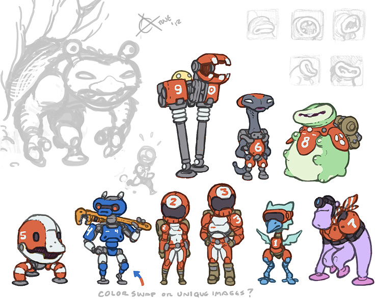
2012 above. Took some time I didn’t have, because upon seeing the old 2006-2009 below, I felt I could reach new places. The text and art below is older and might repeat or conflict with sentiments expressed above.
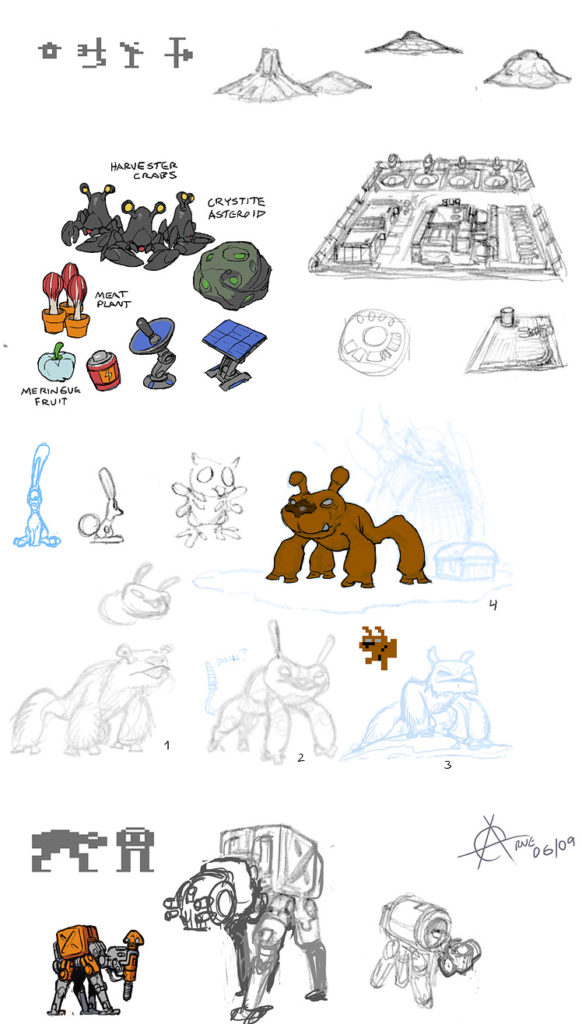
The Leggite sprite is inconsistant, from the side it looks like a Joust ostrich (Joust was the inspiration of balloon fight). From the front it’s similar to a Star Raiders refueler ship (ie. mechanical and blocky). The sideview looks a bit more organic. I think it would be funny with a suspension stilt thing skipping along in the desert, and I made the creature in control a worm or slime with no legs at all, just for contrast. Perhaps it’s fast, but sometimes falls over.
The Spheroid is very shape shifty in my mind. I tried a robotic (Xmen cyclops) head on #1 but it doesn’t allow any expression. I think I’ll always make it the misfortunate one in my little ‘funnies’, cuz it’s funny how it can’t do anything about getting robbed, having no arms and all. Maybe it just has little larvae knobs.
The Bonzoid, like many of the other sprites has a block in the face. Perhaps it is a gasmask or cyclopian goggles. It might be a monoped, but maybe there weren’t enough pixels to draw two legs. Still, draw what you see. The intention of the original artist matters less at this point, unless there’s supplemental art, as there is in the case of the Wampus/Wumpus.
The Mechtron were inspired by these old Basic books. BASIC Games and More BASIC Games (Go to thumbnails). I also made a few designs based on consoles/computers, but in the end (2009) I just drew something which looks like the sprite.
Still, I think the idea of a facial expression on a screen is very fun and silly. Someone presented the idea of making pirate Mechtrons with a little patch over the big pixel eye, which is fun because it’s not actually an eye. Aslo, I’m not sure if Atari-800 biege one works with the camera lens thing. I’m tempted to do a Commodore Sx64 head though, as it corresponds with the shape on the sprite quite well, with some tweaks (screen in the middle, floppy drive on the side, and a lens on the other). Its belly would have a little keyboard it could flip out and re-program itself with (by using the arms, a very silly concept of course).
Wumpus and terrain
I also did some Wampus/Wumpus research. It’s a big, intelligent, possibly deadly, 4-legged, opossum/sloth with suction cups, maybe a drill tail. There was a game called Hunt the Wumpus and it has some vague description of the creature (there even were a few pencil doodles in some old BASIC books).
As I’ve understood it, the M.U.L.E.s are customized in a hangar, then parts of it is deployed to form the …stuff on the lot while a basic M.U.L.E. works the lot. They can also run off, but I suppose they pack their stuff before doing so. It would be interesting to work out some designs where all of this comes together.
I found some interesting white deserts when googling for white desert sand etc. Giving the terrain color would sort of ruin it. Snow might not work, because somehow I get the impression of a desert. I think the map part of the game is very nice and clean graphically, and a regular sand colored desert would feel too plain and normal. They’re on an alien planet, after all.
I explored some ideas for natural resources and wild life, but they might not fit into M.U.L.E..
Pirates
The ship doesn’t match the topdown view much… I have zero patience for perspective, somehow I think I’ll get away with cheating, but I never do of course.
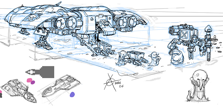
Scenes
These are some ideas for illustrations which could help fluffing up the universe.
- Establish the environment: 50-100m up view of the desert, plots, the river and colony camp near the horizon. Possibly a Wampus in the foreground if I can squeeze in a foreground cliff.
- Pirate Attack (Started on it)
- Gambling in the bar, one armed bandits and strange alien games (Starwars chess with little holo aliens?).
- Misc aliens in the colony camp, street view, casual. Spaceship taking off or landing.
- Overview of the colony camp (city).
- Planet IRATA view, spaceship in the foreground, or crystite asteroid.
- Inside the spaceship, 4 aliens anticipating a tournament.
- An alien leading a M.U.L.E. through the desert.
- Hunt the Wumpus 1,2, ehh wampus.
- Overviews of the land types with deployed / working mules (Energy, Ore, Food).
- The galaxies. Armpull galaxy = big arms. Boird-drop galaxy = splat, etc.
Byline: Art by Niklas Jansson, 2006-2009-2012.
